Introducing the Economy League’s Historic Neighborhood Data Tool
A common issue faced by researchers interested in longitudinal socioeconomic trends is the limited availability and misalignment of historic neighborhood data. While plenty of lower-level neighborhood data exist, the historic boundary and population changes of various administrative units used as proxy neighborhoods (e.g., census tracts, zip codes, city council districts, etc.) can make historic comparisons a cumbersome task. In this Leading Indicator, we highlight a new tool built by the Economy League of Greater Philadelphia with the intention of making historic analyses of Philadelphia’s neighborhoods easier.
A Neighborhood by Any Other Name…
In the world of spatial analytics, there are a multitude of “neighborhoods” to choose from when conducting research. Different agencies and organizations have carved up city landscapes to best navigate, understand, and dispense services at the local level. A few examples of some neighborhood constructs include: the U.S. Census Bureau’s use of census tracts (as well as census blocks and census block groups) to estimate population counts, the U.S. Postal Service’s creation of ZIP codes to efficiently deliver mail, police departments’ use of police districts as jurisdictional areas, and the use of election wards to organize voting across municipalities. Each of these spatial units offer different and unique metrics. While a police district may provide information on crime rates within its boundaries, a census tract can detail demographic or housing estimates. Over time, many of these spatial units are redrawn or realigned to better dispense services or measure populations.
The census tract remains one of the more salient proxy neighborhood spatial units largely because of the amount of information the U.S. Census Bureau requests and estimates within each one. Figure 1 below maps the census tracts used for the 2020 U.S. census. A single census tract will not only detail how many individuals reside in area, but also if they rent or own their home, how many children they have, their income level, their primary means of commuting to work, how many hours they work, etc. While the U.S. Census Bureau tries to draw census tract boundaries that are relatively consistent with local neighborhoods, their primary purpose is for accurate sampling techniques. Most people remain blissfully unaware of what census tract they live or work in and prefer identify neighborhoods by their familiar and historic names and boundaries.
FIGURE 1
SOURCE: U.S. Census Bureau
In addition to misalignment with colloquial neighborhoods, census tracts are subject to change each decade when a new census is conducted. While they were created to remain relatively static [1], they generally change boundaries every decade to better reflect changing populations and physical landscapes. Some census tracts may be split from one decade to the next if the population significantly increased over the decade, or an area of many census tracts may be combined into one if all the housing in these areas was replaced by a single office park. Figure 2 shows how census tracts evolved in Philadelphia by comparing 1950 census tracts with their current 2020 counterparts.
FIGURE 2
SOURCE: U.S. Census Bureau
Changes in boundaries makes it increasingly difficult to compare neighborhood trends over time. This was the main barrier we hoped to overcome with a new tool.
Compiling Census Tracts into Neighborhood
Using the U.S. Census Bureau’s 1950 through 2020 census tracts, as well as Azavea’s spatial neighborhood file made publicly available on OpenDataPhilly, we created a new shapefile of consistent Philadelphia neighborhoods that could both account for unique decade-to-decade census tract changes and better reflect Philadelphia residents’ definitions of their neighborhoods (shown in Figure 3).
FIGURE 3
The centroids of each census tract were used to find consistent attributable boundaries over time. Using these centroids, we completed a “many-to-one” merge where each census tract is assigned to only one neighborhood and cannot be assigned to more than one neighborhood. Some neighborhoods, however, may reflect an aggregate of more than one census tract. Thus, unlike census tracts, the aggregate neighborhood populations are not similarly or normally distributed.
The Power Behind the Tool
To pilot the neighborhood tool’s analytical use, figure 4 details the change in each neighborhood’s concentration of white residents from 1950 to 2020. Figure 4 visualizes the late twentieth century’s “white flight” phenomenon, or the mass exodus of white lower- and middle-class individuals from the city in the 1950s through the early 2000s [2].
FIGURE 4
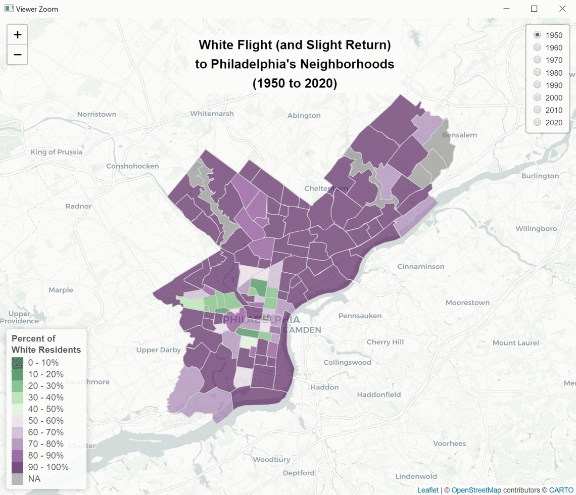
NOTE: Data were obtained by the U.S. Census Bureau
Philadelphia’s white flight has been cited as a major contributor to both the city’s economic decline following World War II and the further concentration of poverty within city neighborhoods. White households were able to take advantage of favorable policy and market incentives to purchase homes within the region’s growing suburban communities [3]. People of color were largely excluded from partaking in these incentives, locking many communities of color in place and denying them the generational-wealth-building opportunities made available to their former white neighbors [3].
To illustrate historic concentrations of poverty in Philadelphia, figure 5 maps the concentration of individuals experiencing poverty using the federal poverty thresholds from 1970 to 2010. The federal measure of poverty was developed in the 1960s and deployed in the 1970 census as a means for understanding the disparity between income and the general cost-of-living [4]. While the measure faces justifiable criticism for its outdated measurement criteria [5], it remains the standard metric for understanding economic disparities. The City of Philadelphia has the highest poverty rate among the ten largest U.S. cities [6]. Figure 6 shows that poverty has largely remained concentrated in Lower North Philadelphia as well as in sections of West Philadelphia. Over time, however, it spread into Upper North Philadelphia as well as the Northeast and Southwest sections of the city.
FIGURE 5
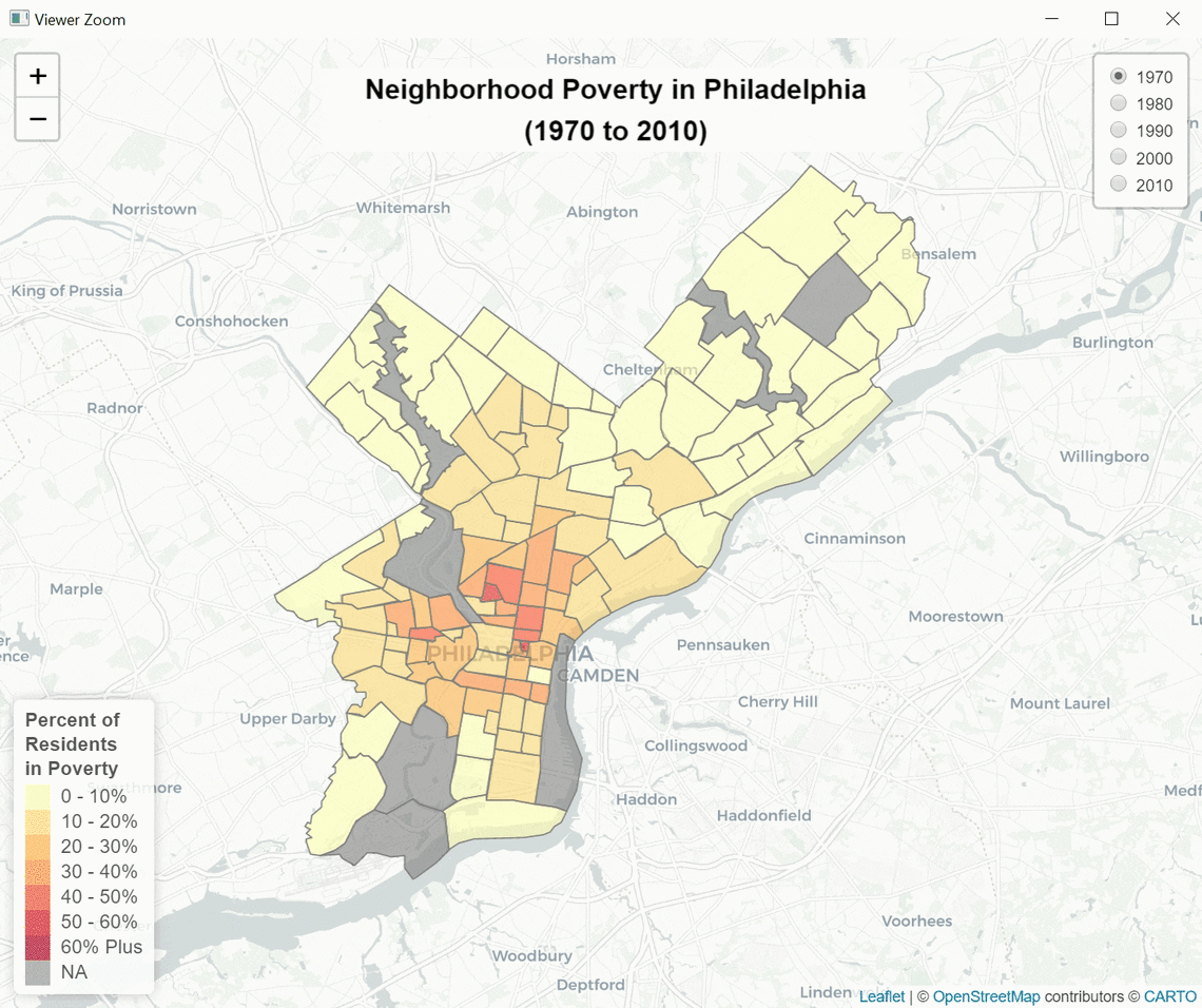
NOTE: Data were obtained by the U.S. Census Bureau
An Evolving Opportunity
The Economy League produced this tool to be used and we invite collaboration and support. We plan to further pilot this tool for unique analyses, like historic demographic and property value changes in the city’s neighborhoods, but we will soon welcome others to use this resource to conduct their own historic analyses of our city’s neighborhoods. We aim for this tool to be used by policymakers and others to promote equitable development and inclusive growth across Philadelphia.
Works Cited
[1] U.S. Census Bureau. N.d. “History: Tracts and Block Numbering Areas.” U.S. Census Bureau. Retrieved from: (https://www.census.gov/history/www/programs/geography/tracts_and_block_numbering_areas.html).
[2] Jackson, Kenneth. 1985. Crabgrass Frontier: The Suburbanization of the United States. New York City, NY: Oxford University Press.
[3] Shields, Michael and Mohona Siddique. 2020. “The Color of Inequality Part 1: Housing and the Built Environment.” Economy League of Greater Philadelphia, 3 June. Retrieved from: (https://economyleague.org/providing-insight/leadingindicator-colorofinequalitypart1).
[4] Fisher, Gordon M. 1992. “The Development and History of the Poverty Thresholds.” Social Security Bulletin, 55(1): 43-46. Retrieved from: (https://www.ssa.gov/history/fisheronpoverty.html).
[5] O’Brien, Rourke L. & David S. Pedulla. 2010. “Beyond the Poverty Line.” Stanford Social Innovation Review, Fall. Retrieved from: (https://ssir.org/articles/entry/beyond_the_poverty_line).
[6] U.S. Census Bureau. 2020. 2015-2019 American Community Survey 5-Year Estimates. Retrieved from: (https://www.census.gov/data.html).